Role:
Senior Product Designer
Timeline:
June - August 2025
Scope:
Web + Embedded Widget
Collaborator:
Product Strategy, PM, Engineering (SE + QE)
One of the most common questions First Dollar partners ask is: “If we choose First Dollar, will it feel like it belongs within our product?” It’s a fair question, and the answer isn’t one-size-fits-all. The right solution depends on a partner’s platform, resources, and goals.
First Dollar is built around white-labeling, empowering partners to deliver financial benefits that feel native to their product, not a third-party add-on.
Embeddable widgets are a key part of that strategy, and this initiative expanded that ecosystem with a dedicated debit card management widget, giving partners a lightweight, branded card experience with minimal integration effort.
01 – Background
First Dollar’s existing widget offerings covered deposits and reimbursements, but stopped short of card management. As partners grew more sophisticated in their product expectations and needs, a gap was introduced. Tenants like Ecton wanted to offer cardholders a seamless card management experience (e.g. viewing virtual and physical debit cards, activation and deactivation, and managing dependent cards) without using First Dollar’s native platform.
The goal was clear: build an embeddable widget that delivers the full card accountholder experience, flexes to a partner’s brand, and integrates without a heavy engineering lift.
Key business drivers:
Customization Without Complexity
Enable tenants to offer tailored experiences without needing a dedicated development team
Faster Time to Market
A plug-and-play solution that reduces integration timelines
Partner Differentiation
Support tenants who want a branded, controlled cardholder experience
02 – The Problem
What wasn’t working
Partners had no middle ground: adopt the full native platform or build something custom from scratch. There was no simple, lightweight option for card management in between.
First Dollar widgets are designed to change that. Unlike complex API integrations that require dedicated development teams and months of work, widgets require just a few lines of JavaScript, making it easier than ever for partners to offer on-brand, embedded experiences without starting from scratch.
The gap was clear: card management needed the same treatment.
What we set out to solve
03 – Process & Key decisions
Research
With the problem clearly defined, the focus shifted to making the right design decisions, not just for the widget itself, but for the broader ecosystem it needed to fit into.
I started with a quick review of how other embeddable widgets handle scope and flexibility, then audited First Dollar’s existing web app cards feature to identify what functionality should carry over and where there was room to improve.
Design Decisions
Clarifying Card Actions
Separated self-serve actions from support-required ones, making it clear what users can do independently and reducing unnecessary friction.
Restructuring Card UI
Redesigned the card page structure and IA for clarity, then carried that thinking directly into the widget for a consistent experience across both surfaces.
Designing for Flexibility
Built to sit within a side panel with a minimal footprint, key UI elements adapt to partner branding without disrupting the experience.
04 – Designs
The widget surfaces the full card management experience in a compact, structured layout. Users can view card status, access actions, manage dependent cards, and handle activation, all within the partner’s product environment.
Design Principles
Simplicity First
No unnecessary steps or friction
Clear Hierarchy
Status, states and action are scannable & intuitive
Brand Flexibility
Adapting to partner brand without compromising usability
Some Widget Screens
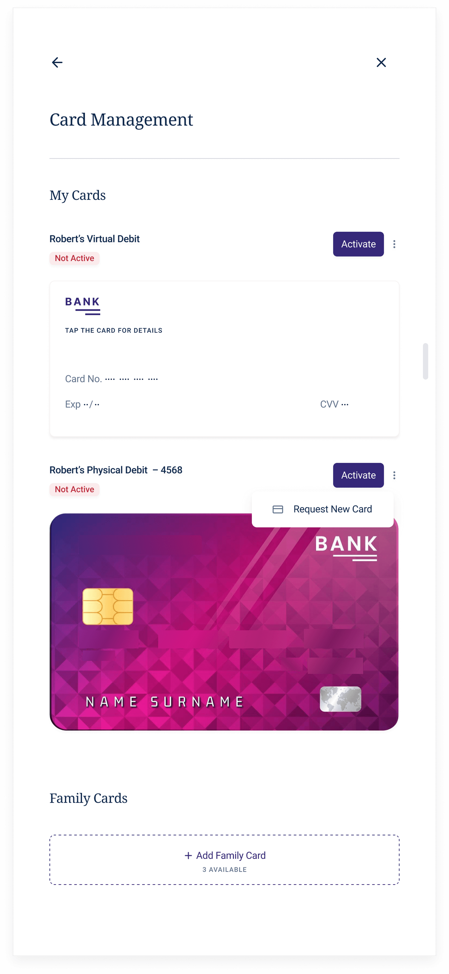
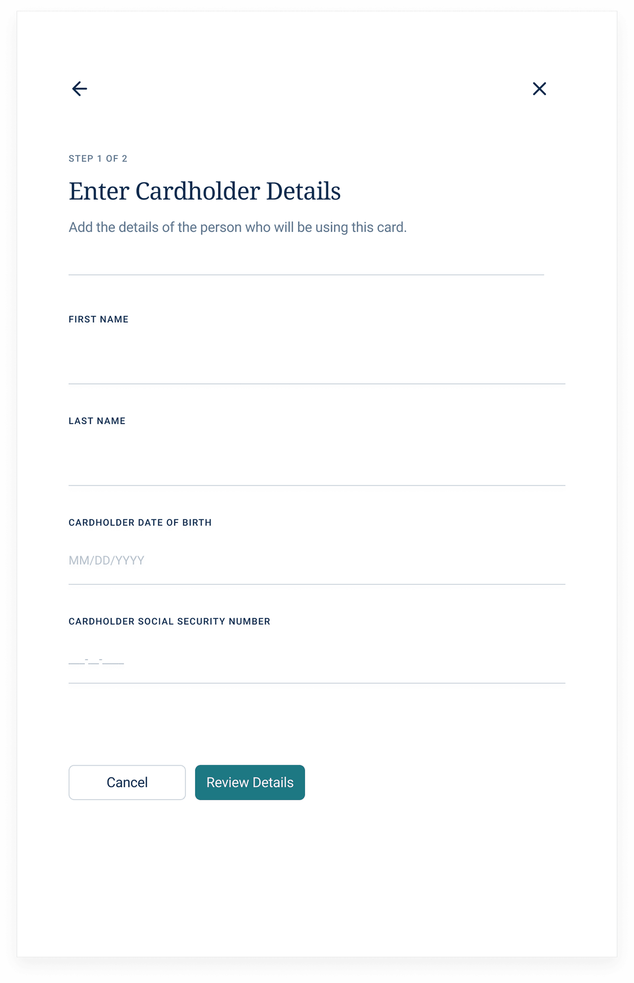
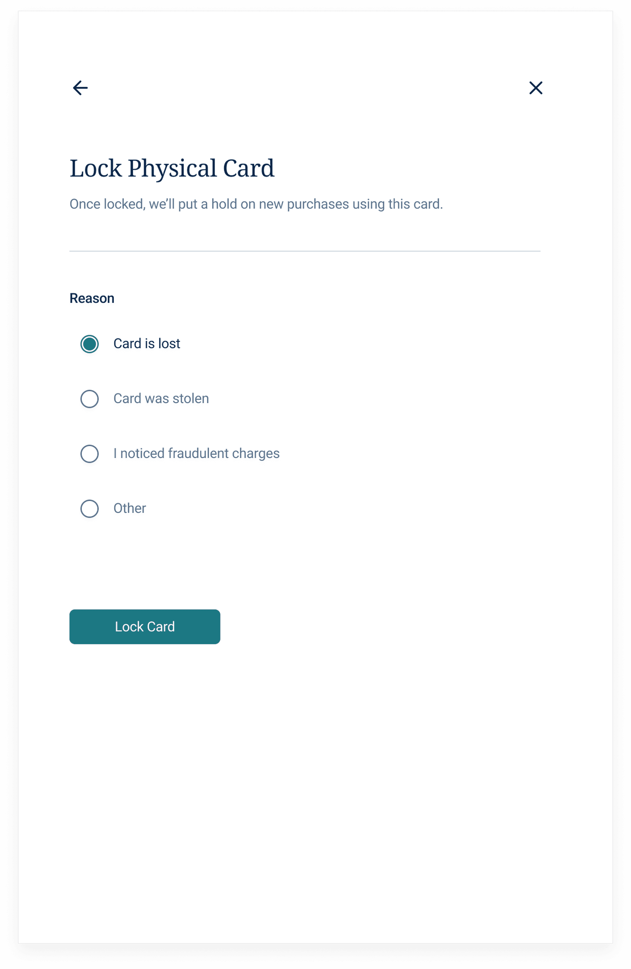
🔗 Try it yourself: Explore the live card widget sandbox here to interact with the experience firsthand.
05 – feedback & outcome
Stakeholders across operations, design, product, and marketing contributed feedback throughout the process. The consistent theme: keep flows simple, make card actions obvious, and reduce friction wherever possible. A focused copy pass with our UX writer was equally important. Language in card management carries real weight, so copy was treated as a design decision, not an afterthought.
The result was a widget that didn’t just close a product gap, it delivered measurable value for partners and their members.
Reduced Support Costs
Members can handle card activation and management independently, eliminating routine support calls and freeing up partner resources.
Faster Time to Value
Virtual card access means members can start using benefits immediately after enrollment, no waiting, no friction.
Higher Member Satisfaction
Members stay within a familiar, branded experience instead of being redirected to an external portal, creating a smoother and more cohesive journey.
Stronger Brand Presence
Every card interaction reinforces the partner's brand, not First Dollar's. That's the whole point.
